
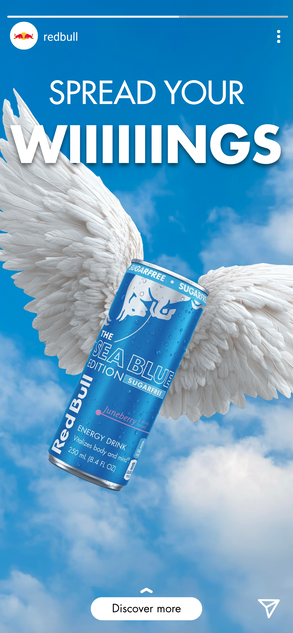
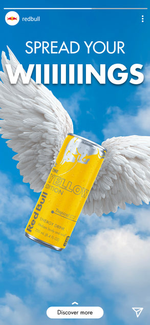
For my Introduction to Qualitative Research class, my group created a situation analysis and research plan for Red Bull. Using our Key Insights and SMIT, I created our creative deliverables.
Key Insights: Minimal health concerns, Iconic, but not preferred, Functional, not lifestyle-based, Accessibility = Entry
Objective: The objective is to convince Gen Zto venture outside their comfort zones and try different Red Bull flavors tofind one they love.
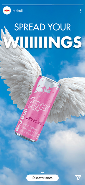
Single Most Important Thought: Spread your wings.
Instagram Carousel: As users scroll through the carousel, they'll see the variety of flavors Red Bull has to offer and be enticed to try them. This targets existing followers, but through paid promotion for the post, it can reach non-followers as well.
Instagram Story Ads: These variations would appear as users tap through stores. They would reach both followers and non-followers, providing easy access to learn more information about the flavors.
TV Commercial: I illustrated a storyboard for a commercial promoting the "Spread your wings" campaign. I tried to keep the existing Red Bull illustration style, since it is already recognizable.
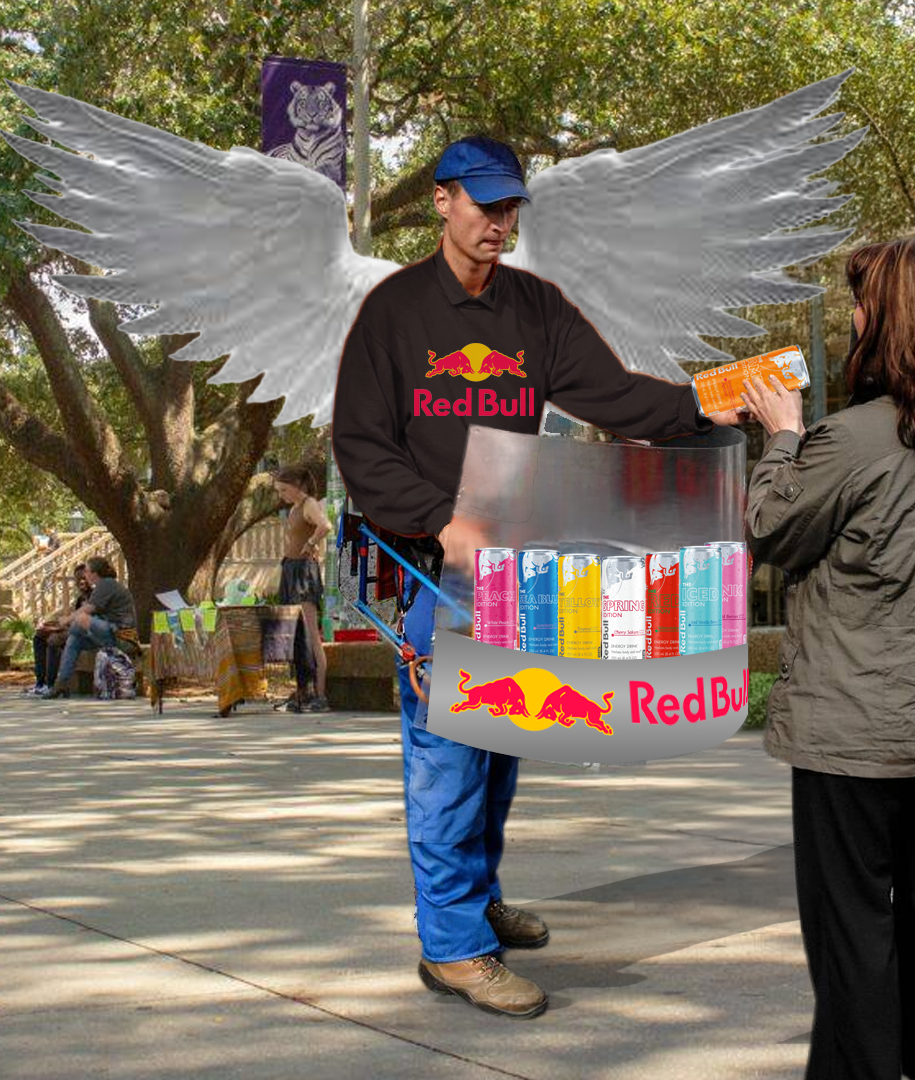
Free Samples: Having someone hand out free samples increases accessibility to the lineup. The person would wear gigantic wings, drawing attention and potential UGC from being posted on students' social media accounts. Doing this during a high-stress time like finals appeals to consumers when they want and need energy drinks the most, according to our research.


.png)
.png)
Length: 15 seconds
Description: Animation of a young man trying different Red Bull flavors. With each ones, his wings grow larger, and the background changes color to match the can he’s trying. Background transitions are a watercolor wash.
Ad ends with the tagline “Spread your wiiings” spoken and displayed across the screen.
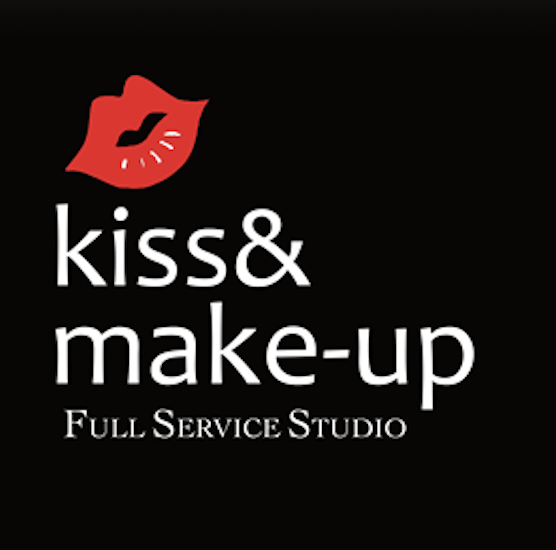
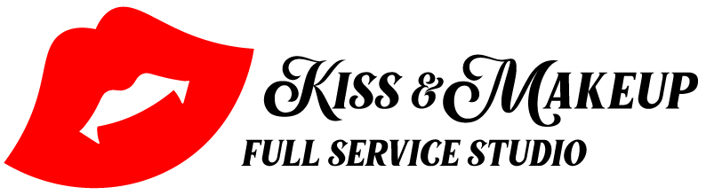
We redesigned a logo for a local salon. I looked at their social media and saw they had an darker, edgier aesthetic. I used this to add fangs to the lips, since I wanted to keep that distinct element of the original logo. I also changed the font to have more movement and sophistication.
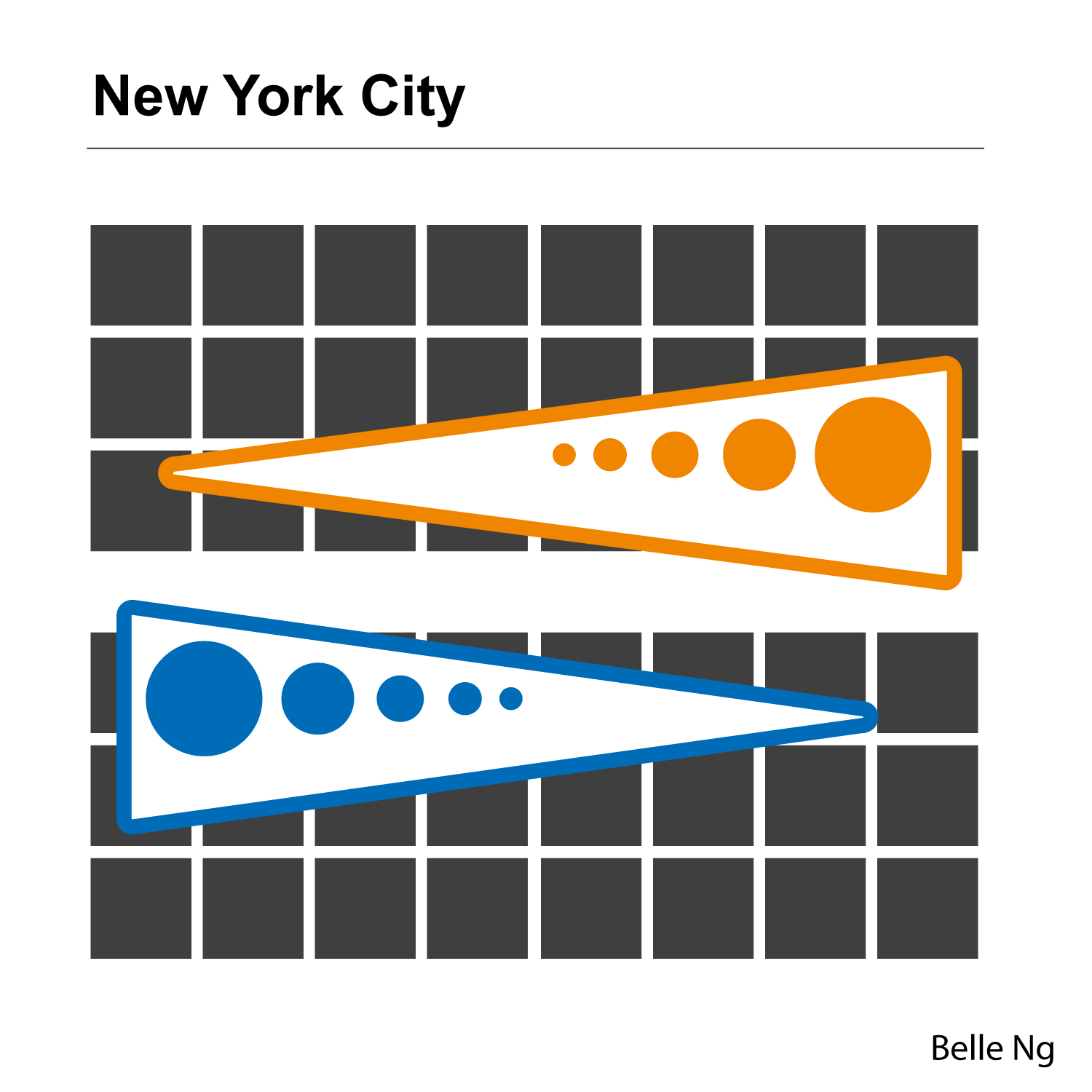
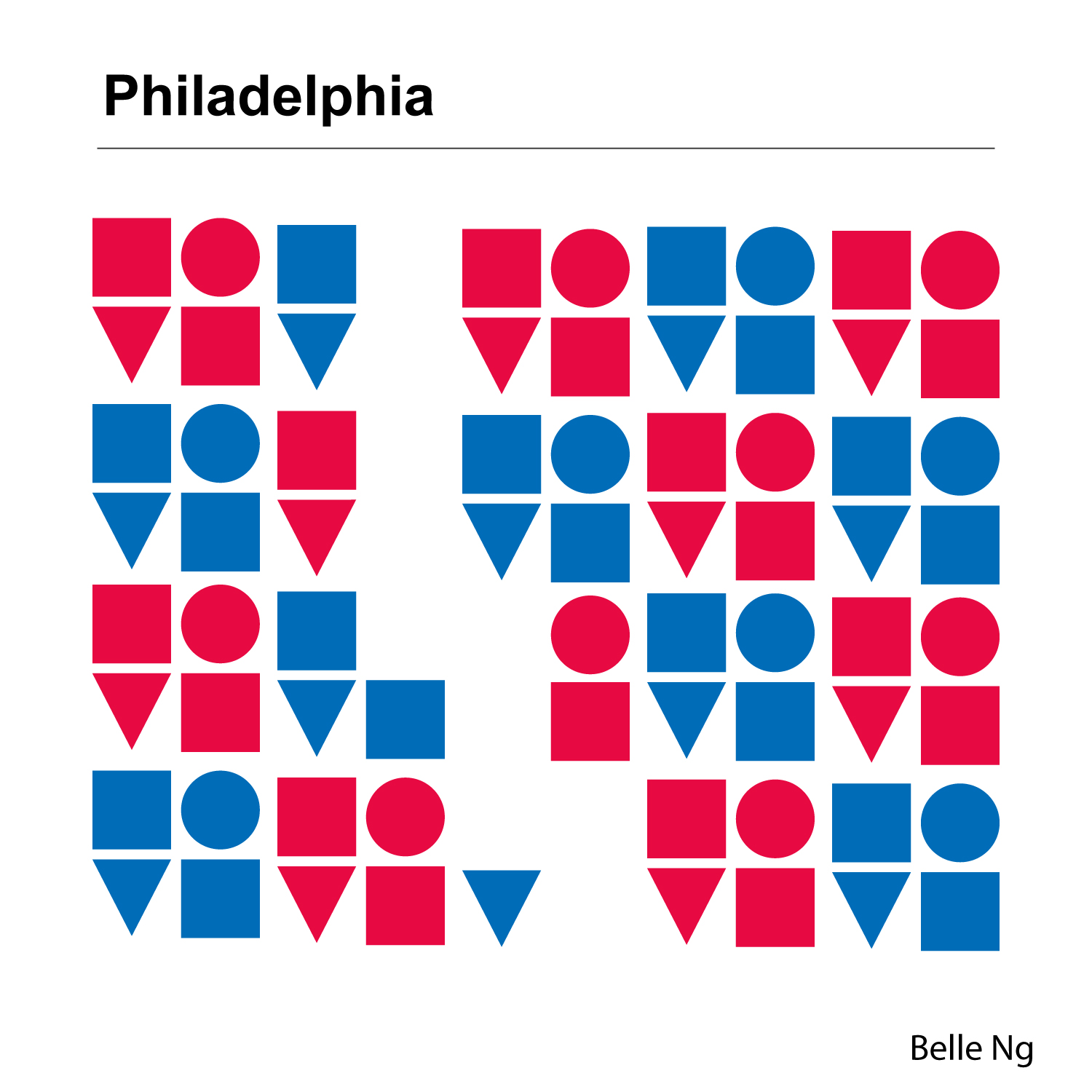
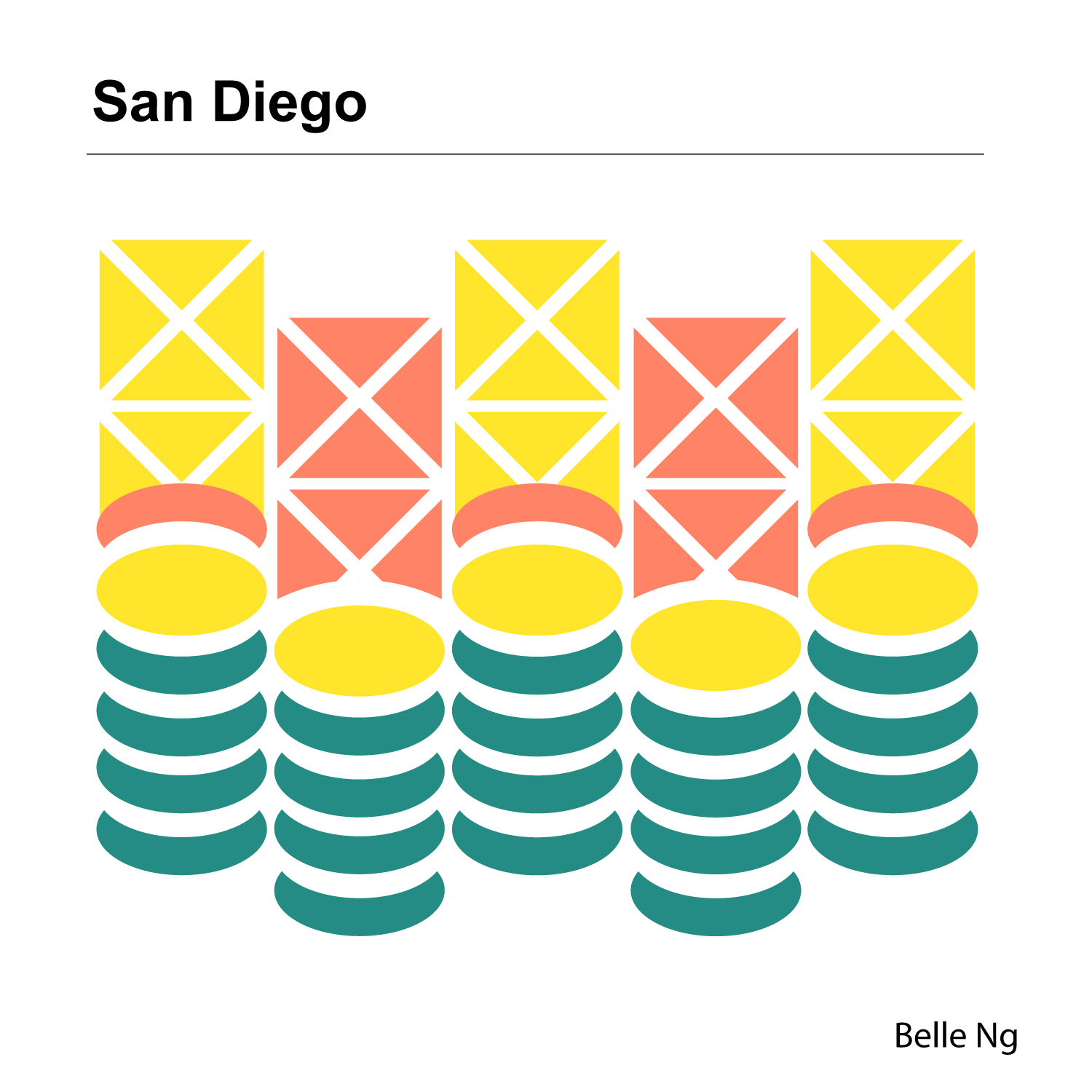
For this assignment, we had to reimagine cities and translate them into compositions each using just three shapes and three colors. For New York, I used the iconic Mets and Knicks colors to create abstract train shapes, using size to create dimension. For Philadelphia, I simplified the iconic LOVE sign and used repeated it with alternating colors. I remove parts to create a crack similar to the one in the Liberty Bell. For San Diego, I was inspired by the Spanish-tiled roofing and the blend of nature with city infrastructure. The bottom of the design depicts beaches and waves, while the top depicts a cityscape.
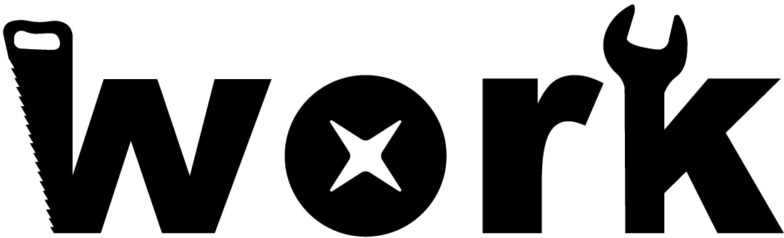
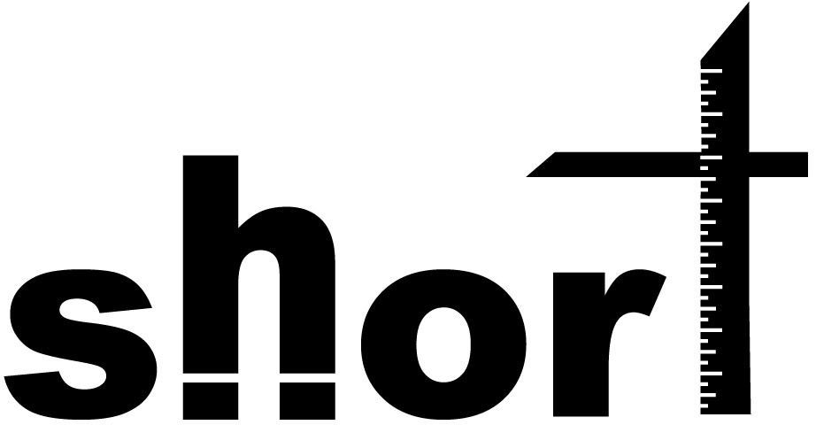
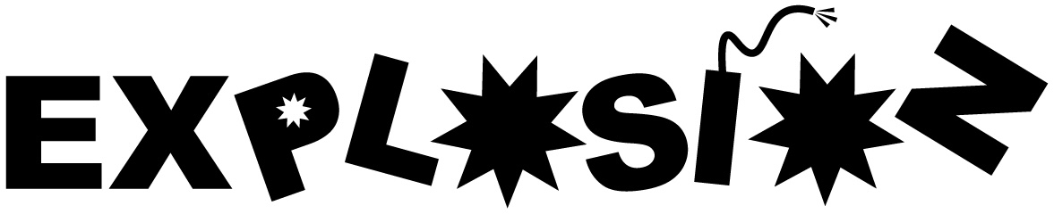
For this project, we had to visualize different abstract words. I played with the letterforms to make compositions that would cohesively represent the words. "Work" contains different tools involved in woodworking or handiwork. "Short" represents the line at a theme park, where the letters are too short to ride, but "h" is trying to appear taller. "Explosion" takes a relatively literal approach, using dynamite and sharp stars as the letters.
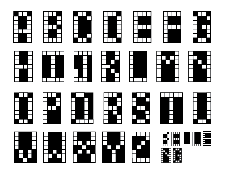
To create my own alphabet, I was inspired by something I love and do almost every day — crosswords. I love learning miscellaneous facts from them and seeing recurring clues. For a poster, I made a mockup that uses my alphabet, but also contains a crossword consisting of common clues.
.png)
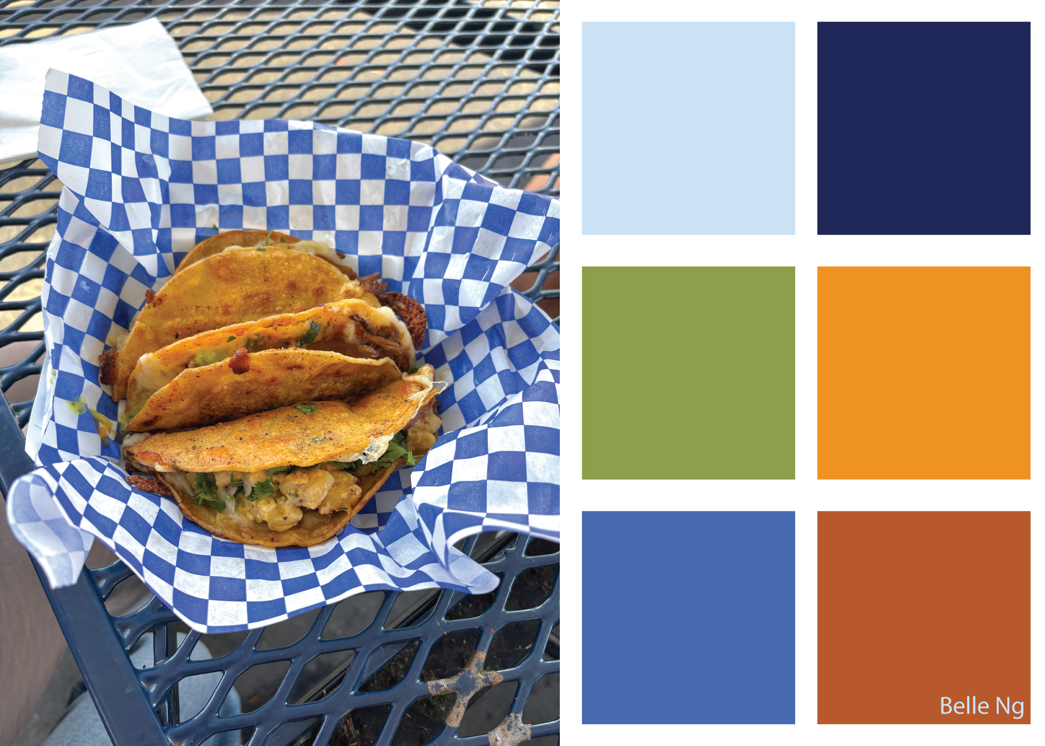
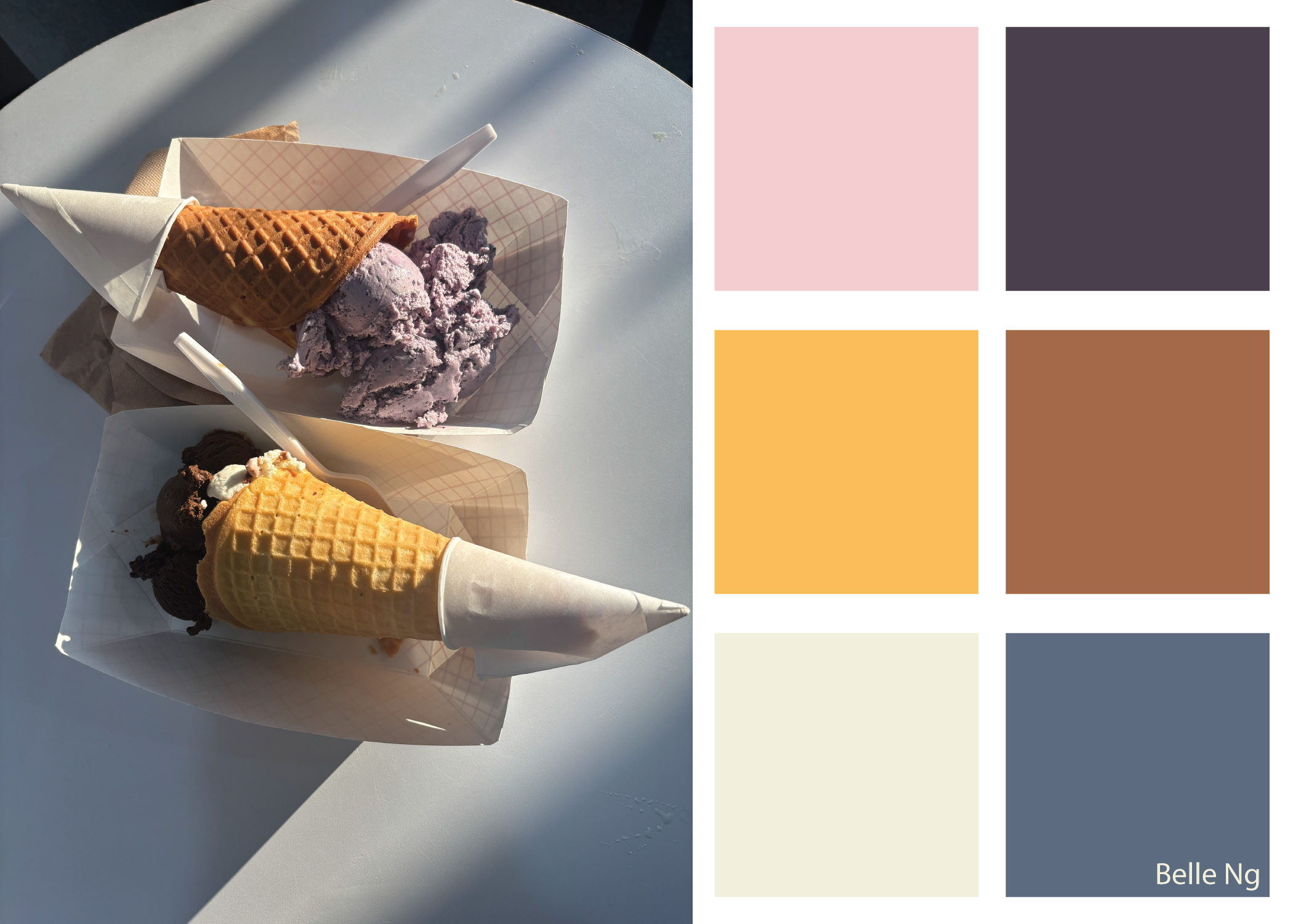
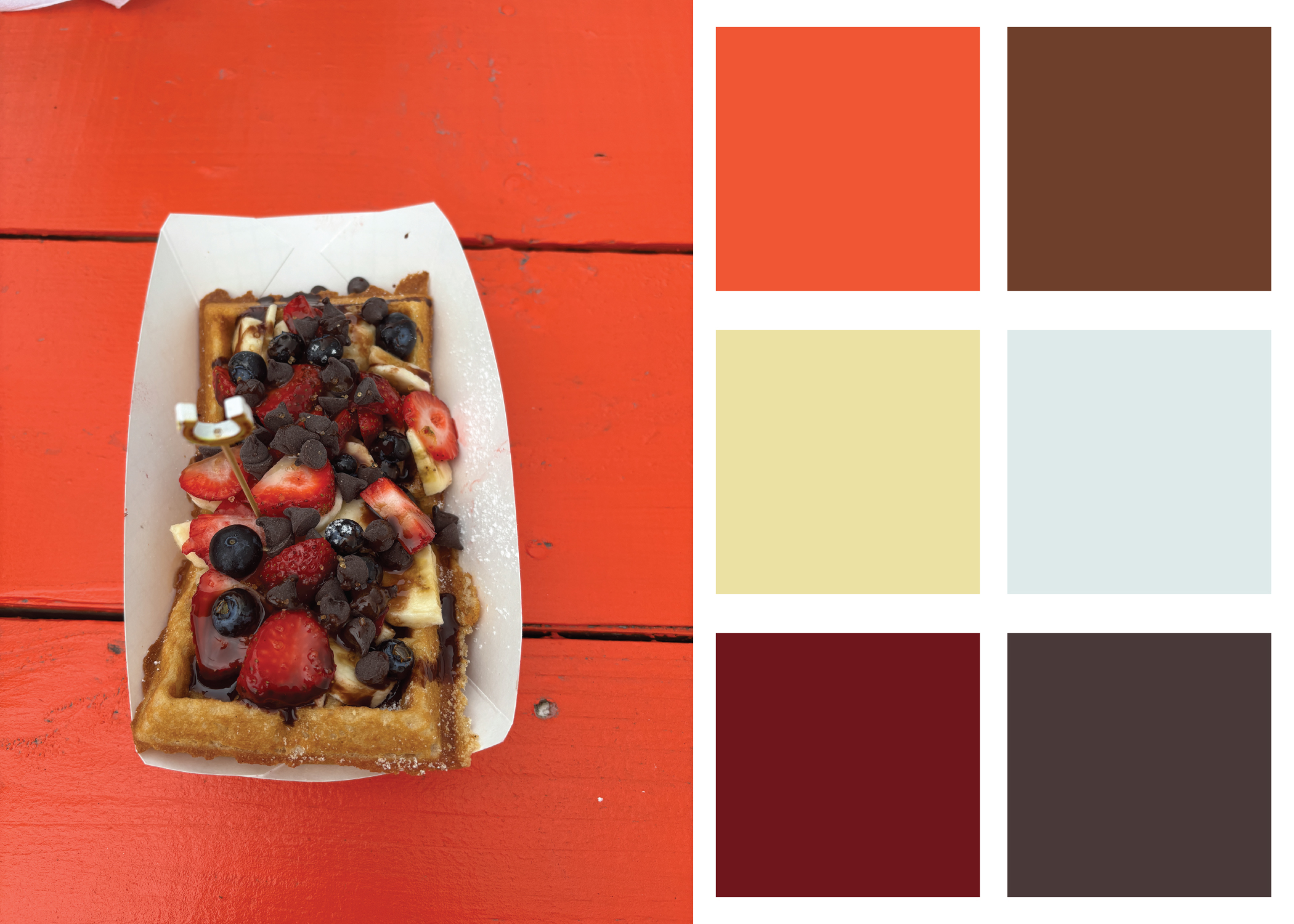
For this assignment, we had to pull color palettes from photos we've taken with an overarching theme. My theme was "food I've eaten," and I selected my most appetizing photos that I thought I could pull interesting color schemes from. I made sure that the palettes would have enough contrast to actually be used.
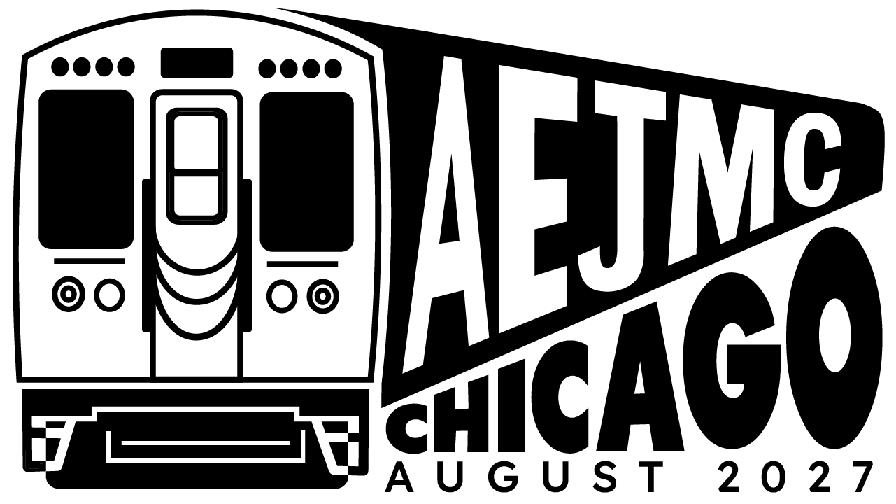
I designed a logo for the annual Association for Education in Journalism and Mass Communication (AEJMC) conference. Each year, students submit their logo designs for the chance to have it become the next year's conference logo. The logo should encapsulate the energy of the host city, and next year's city is Chicago. I made a version of the famous El train, where the AEJMC letters stretch to the back. The playful typography expresses the life and excitement in the city, with a strong reference to its iconic transportation system.